Compeat Nutrition
Sports dietitian service, built to empower active individuals to reach their ambitions. Designed for every moment on their fitness journey.
Agency Craft Store Year 2016-18
Project goal
Create a digital experience that redefines the interaction with a sports dietitian. Brand and product.
My role
I led the design of Compeat Nutrition between May 2016 and January 2018. The project included brand, website, two sided web servicing platform (customer - dietitian), CMS customisation (wordpress). The project was completed in three phases.
The work centralised on adding value to athletes by giving them an avenue to access quality nutritional advice specific to their activity. Information from a world class sports dietitian.
Up until January 2018, I worked to evolve the service and add features that solved customer pain points.
Research
I focused the initial research on triathletes, as they fit the target mindsets and are ‘advanced users’ which served as a good test case for others. Using gorilla research approaches to conduct ethnographic research, I put myself in an athletes shoes – I trained 10+ hours a week and ate from a compeat plan. I interviewed semi-pro athletes, sport dietitians, and weekend warriors.
Key stakeholders were consulted throughout the journey and co-designed with. These people were the Sports Dietitian and Pro Triathlete.
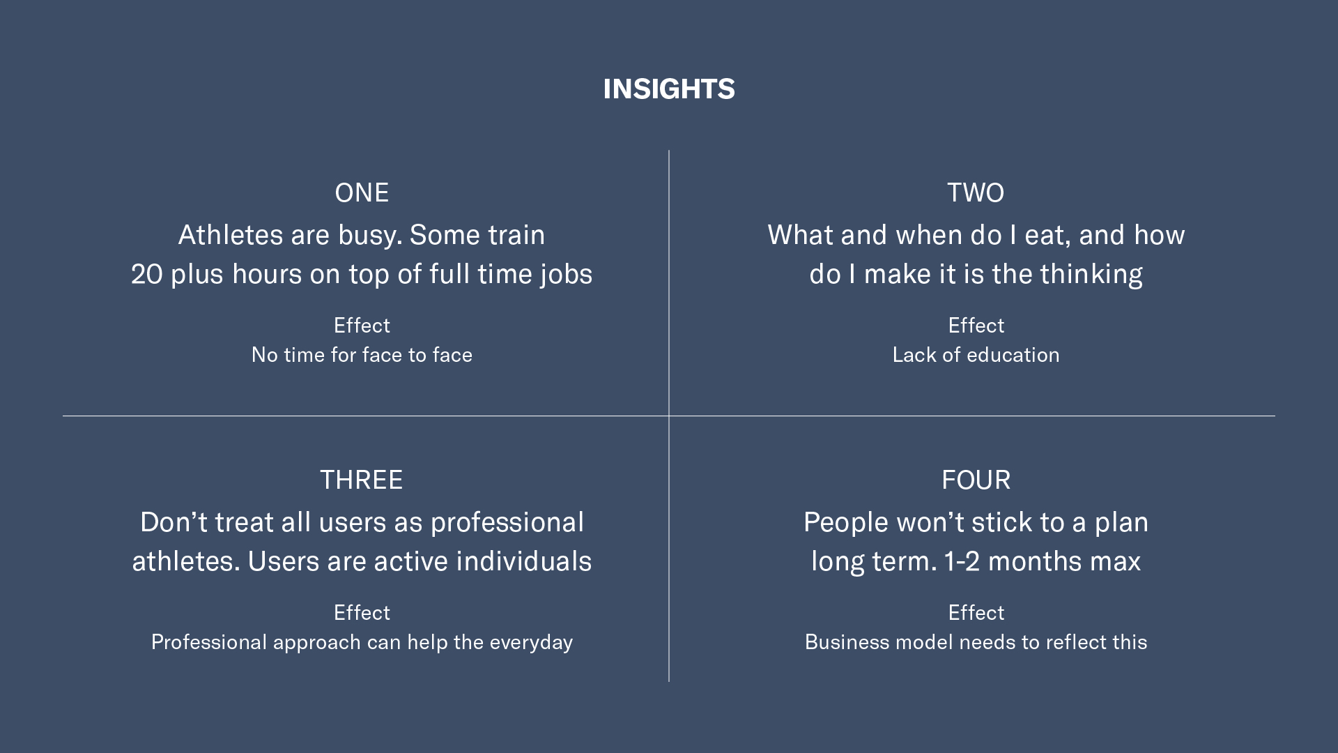
Four main guiding insights

The three archetypes meant that we could focus on specific problems each one would face
Branding
The branding for Compeat was chosen for its striking aesthetic and the concept of before and after. Before Compeat and after Compeat. What you are now capable of achieving on your journey.
Researching competitiors in the field we understood that there is not a lot of good design in the Dietetics / Nutrition space. This gave us an opportunity to stand out with something solid.
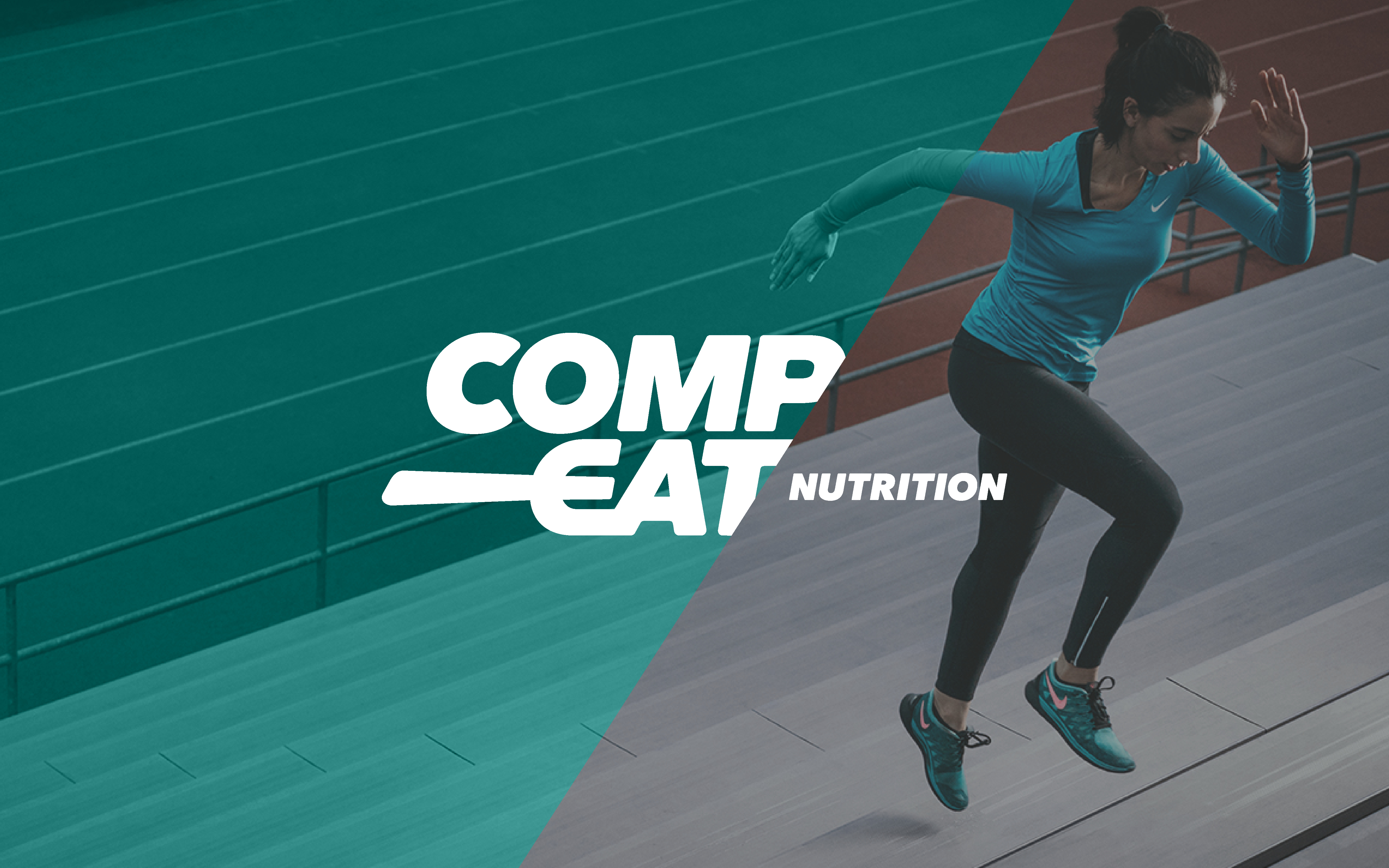
Image styling and use of the compeat before and after concept
Marketing website
The marketing site is the opportunity to let the customer know the value of Compeat. It's the proof that the message seen on social media (main promotion channel) is authentic.
We did two interations of the marketing site. While the platform was being designed and built, the initial site functioned as a way for Compeat to gather clients. We were testing the value proposition. After the initial launch we documented the questions that were being asked and fed these into the platform design.
After the platform was soft launched, a second much simpler site was built. We reduced the pages from 20 to three. We simplifed the message to let the customer quickly understand the value proposition.
Version one - we found that users didn't scroll and lots of questions came to the contact centre
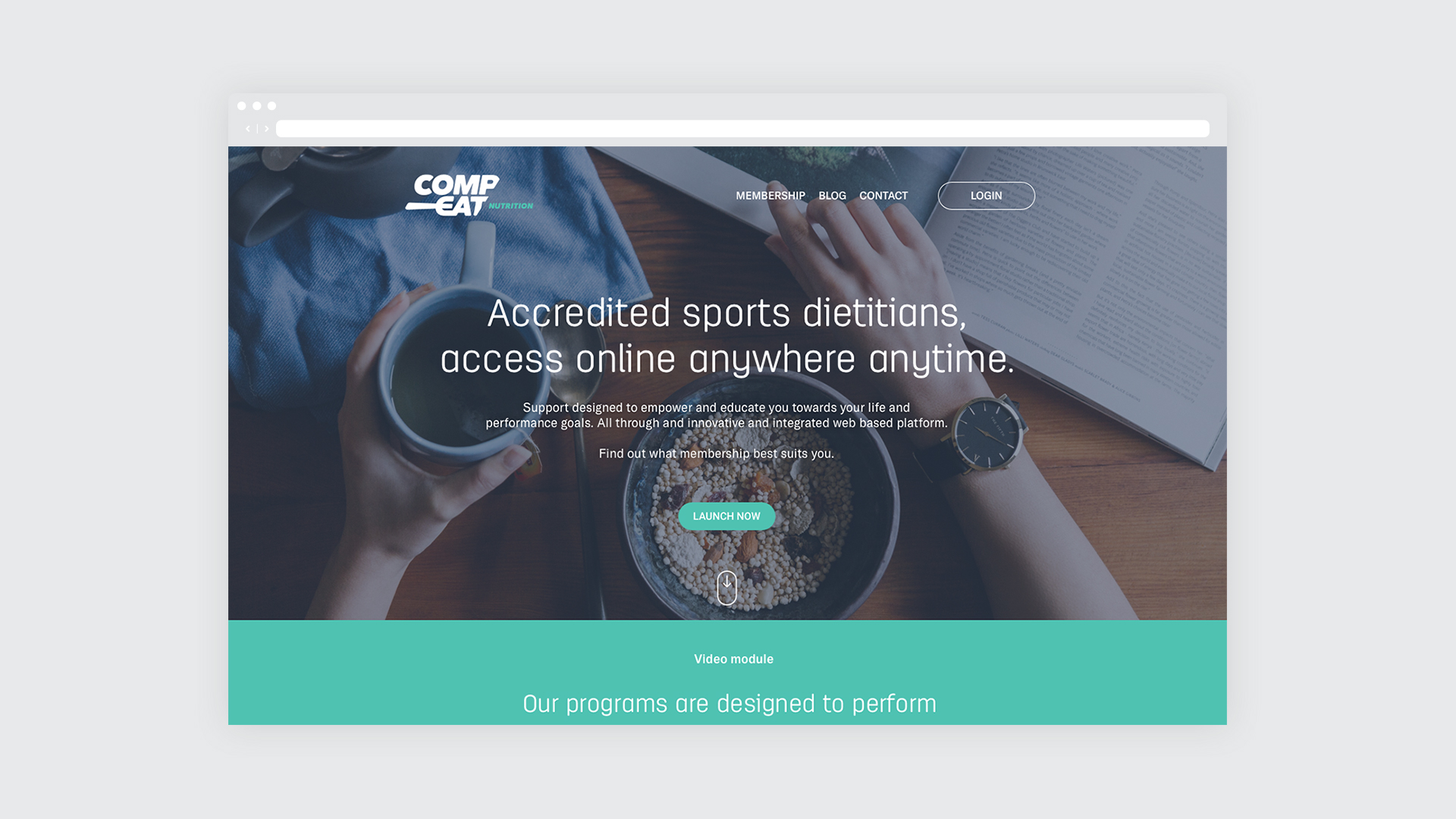
Version two - simplified site with a home page and a memberships page. The blog was also introducted.

Simple description of the membership types on offer
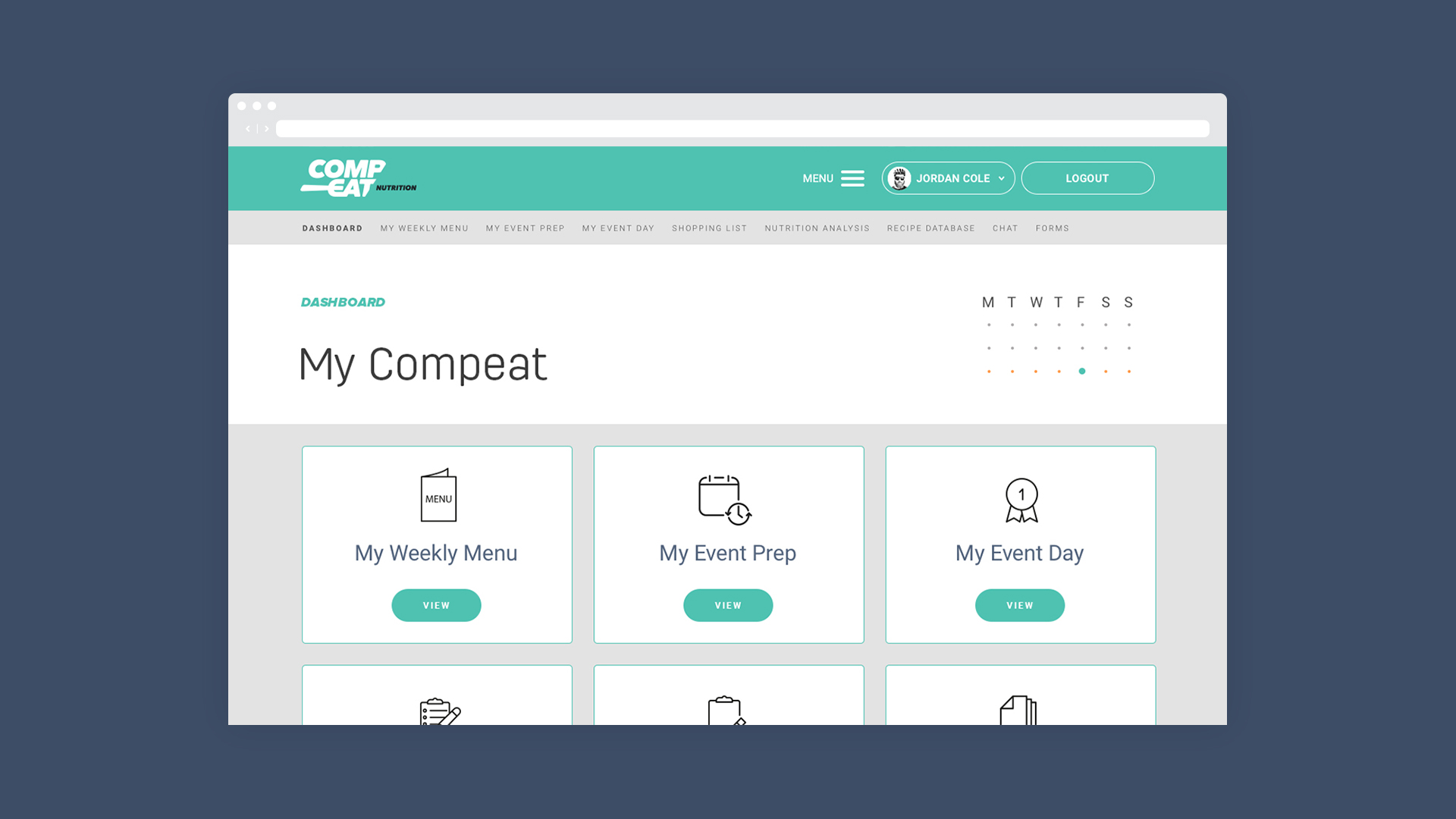
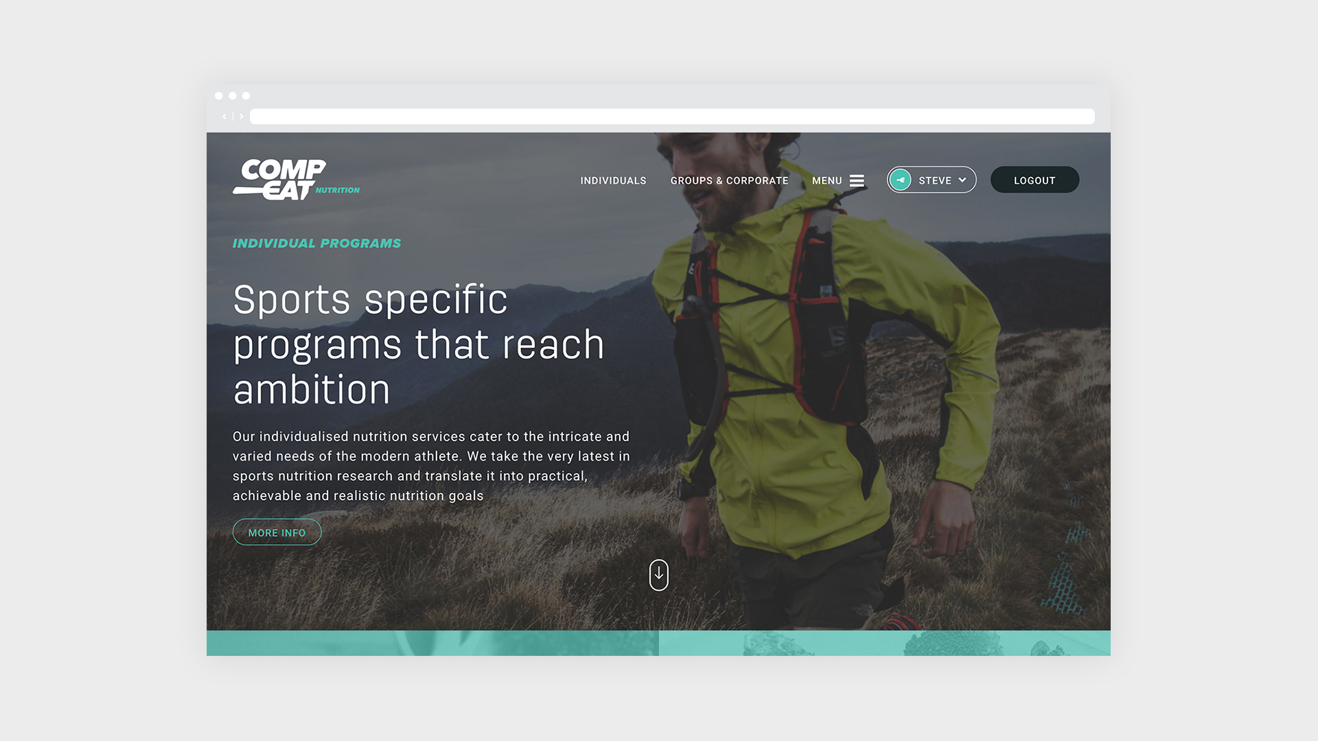
Servicing platform
Understanding that sport and exercise is a journey gives us the ability to design a service for customers that adapts to their changing needs. Compeat programs are made to facilitate change and get results, they are designed for athletes to reach ambition.
The different motivations of customers need to be understood to design a service to match their goals. An olympic athlete and a person hitting the track for the first time share a lot in common, though on face value they might seem to be on a entirly different plain.
To break this down we looked at a persons day – their time and their activities completed. There are a lot of similarities that can be added to the service experience. Some people prepare meals in advance to fit within their busy life or cook something for the first time.
Good intentions at the begining mean that people stay on the plan for the first one to two months. In the third month, they begin to waver, and by the fourth they drop back to old habits. We wanted to have an experience that allowed the athlete to still have access to a service that supports their change.
If we can change the thinking, we will change the behaviour. We want people to know that it's ok to not stick with something unrealistic, and know that change is gradual.
Below is what we made and some of the learnings that meant we made changes as needed.
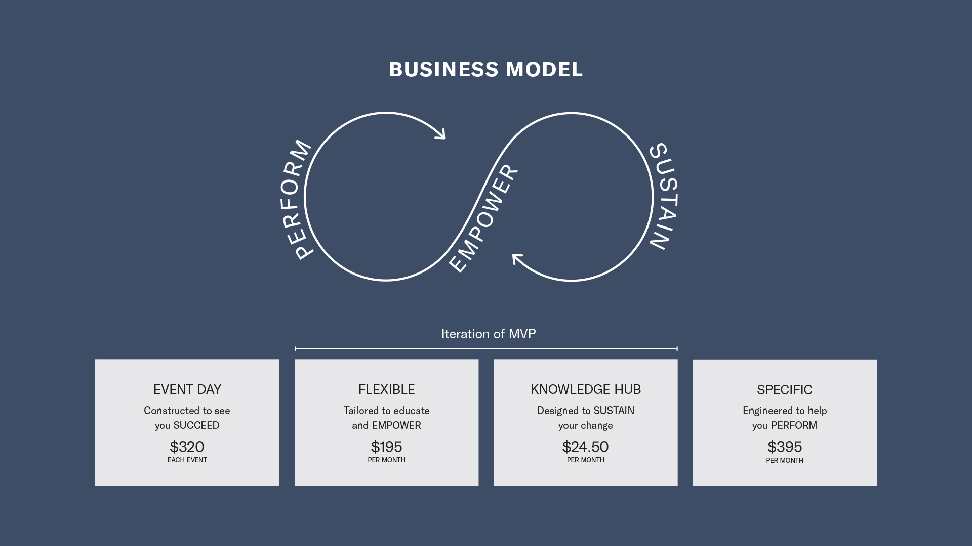
The intial platform had two main feature sets - Event Day (targeted race eating plan) and Specific (a monthly meal plan), after the initial launch it was proven that a sustain piece was missing from the experience
Modular home page design - used to solve the multiple memberships problem - as memberships change, features are reduced
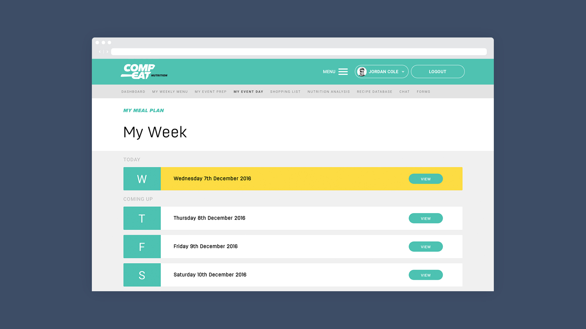
Choose the day you want to view your menu for
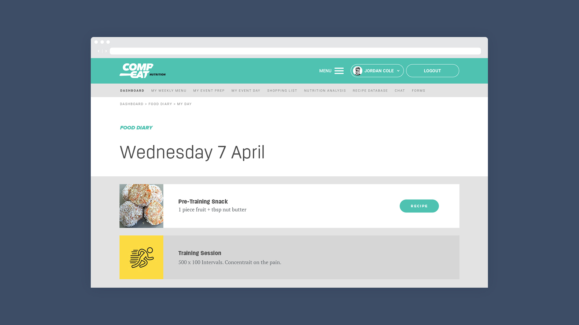
Food for the day with training added from training plan supplied via coach or Training Peaks
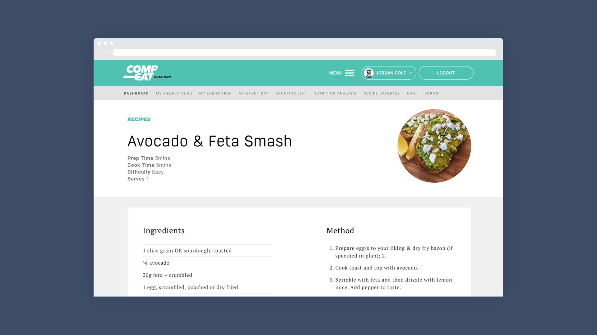
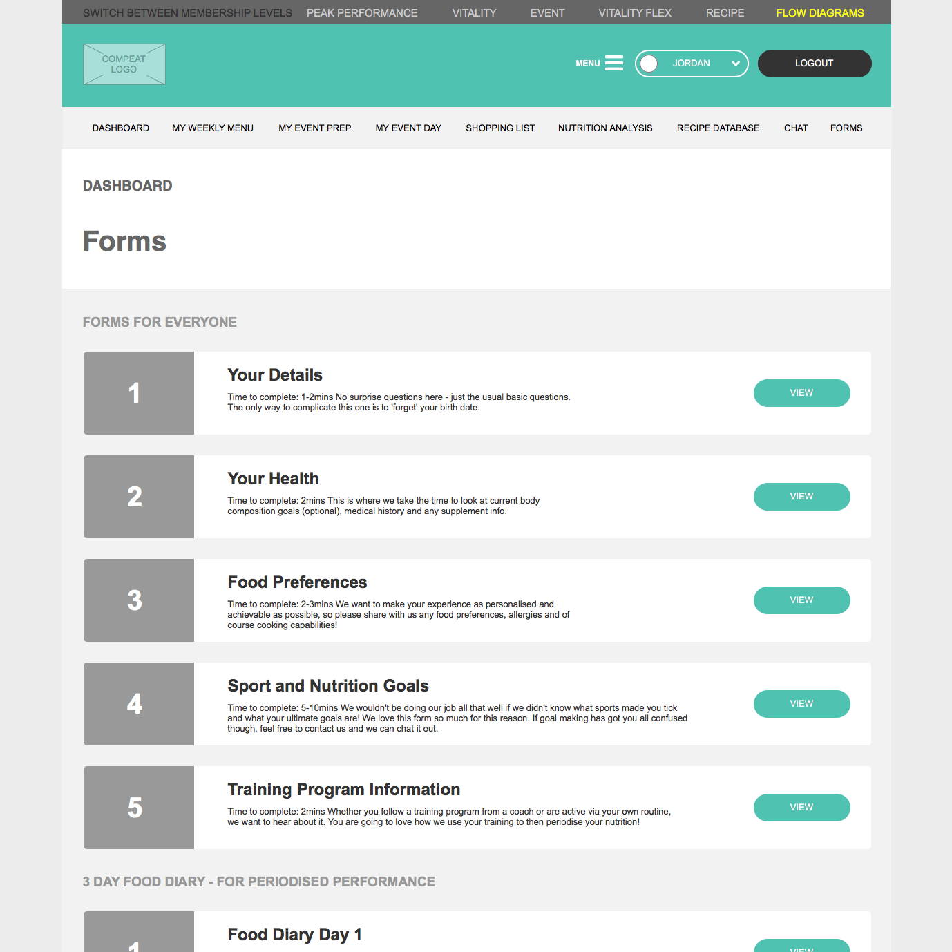
Recipe with instructions on how to cook the food
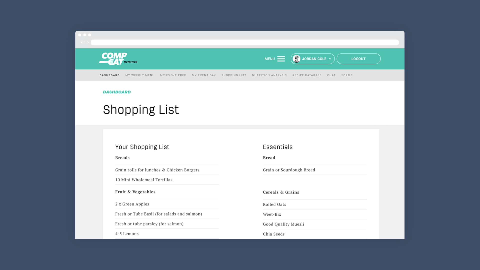
The weekly menu was then built into a shopping list for customers to purchase the ingredients they need to cook
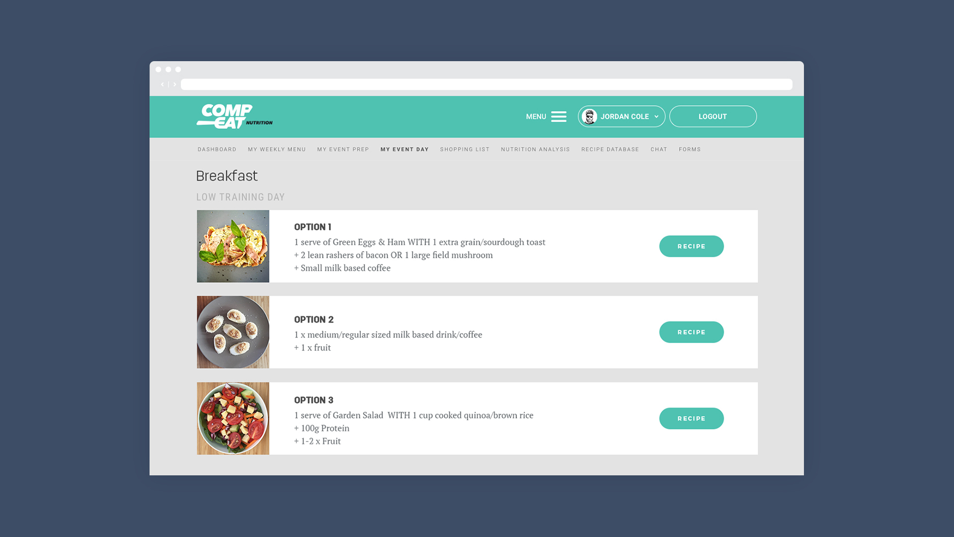
The meal plan is the hero - if the athlete dosn't know how to cook the food they can got to the specific recipe
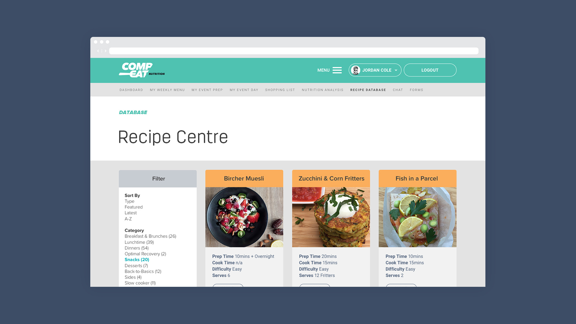
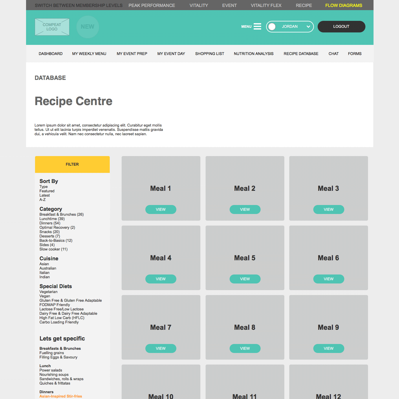
Recipe Hub
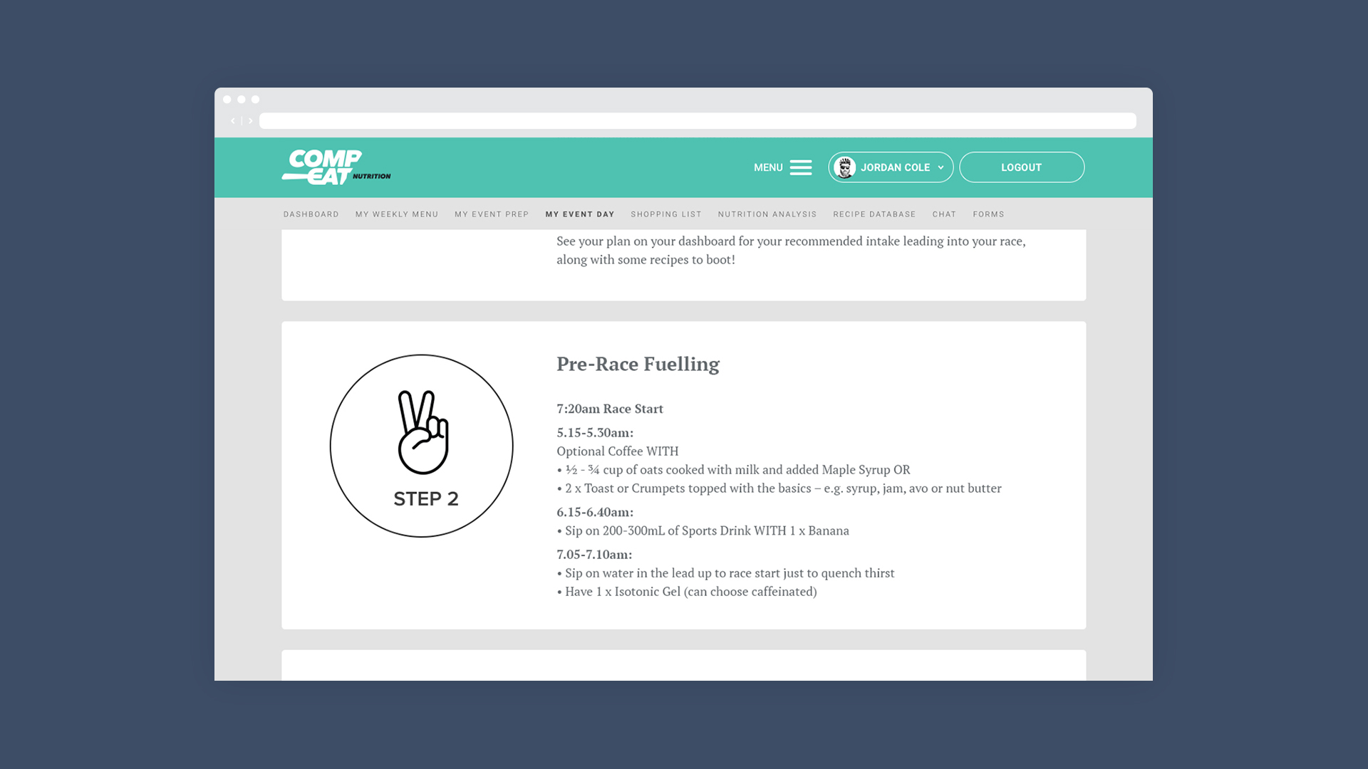
Event day
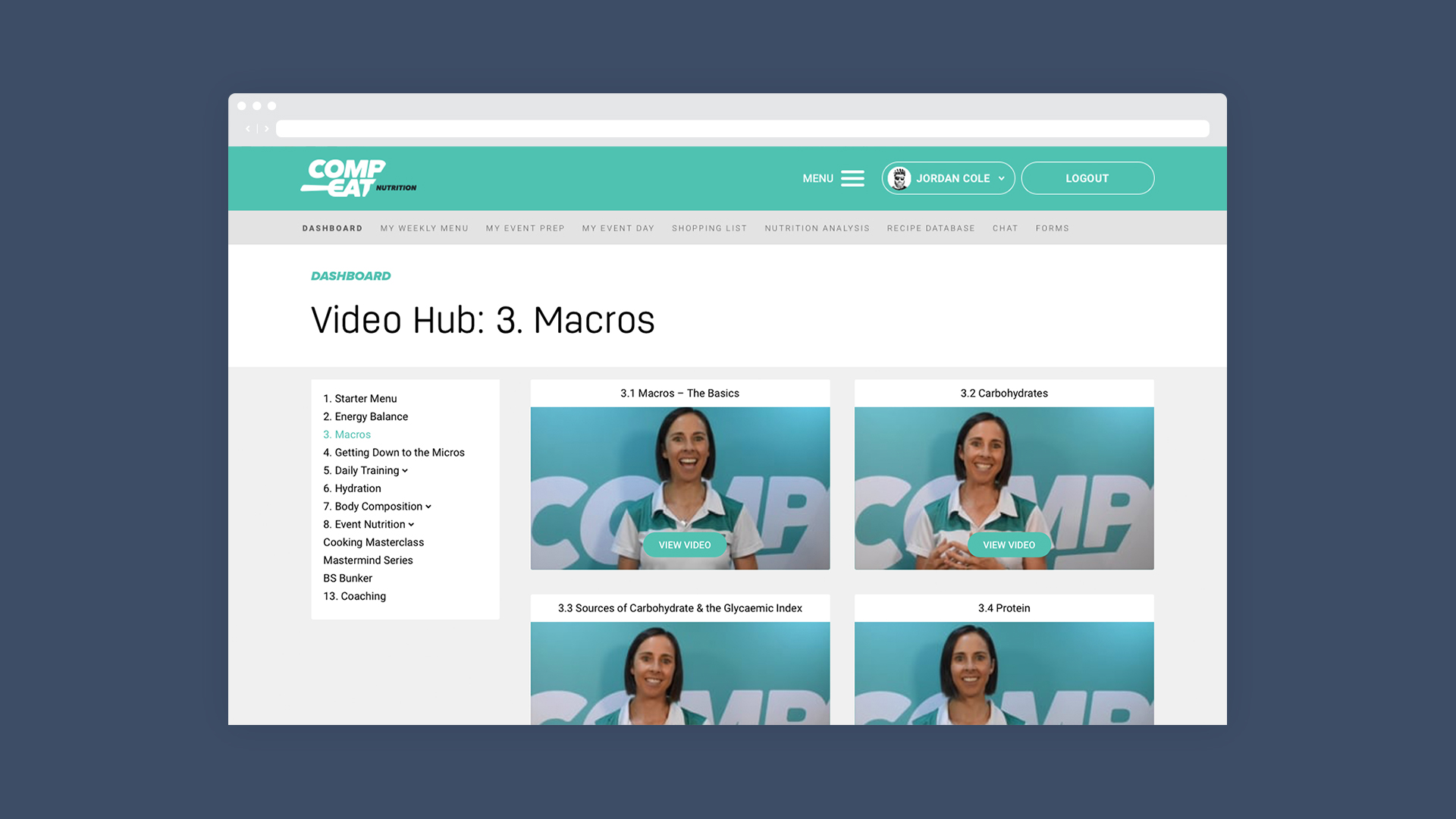
Video Hub
Develop & Deliver
How we got there
With the lean approach to the work, only artifacts that we necessary in communicating to the team were created. These things are not published but are valuable for understanding. We had the approach that the product is the hero.
Process
Design thinking process was used to create Compeat Nutrition. The 4 main stages Discover, Define, Develop, Deliver. Convergent and Divergent thinking. Of course it's never as linear and the classic squigggle to line happened on this project as we learnt. Design is never truly done.
Site map
Used to understand where all the content would fit and make sure flows were logical. The site maps presented are of the intial platform and then after expansion with the new memberships and marketing site simplification.
We made site maps for the memberships to understand how people would access infomation. We needed to show what their flows would be if a feature idea was implimented.
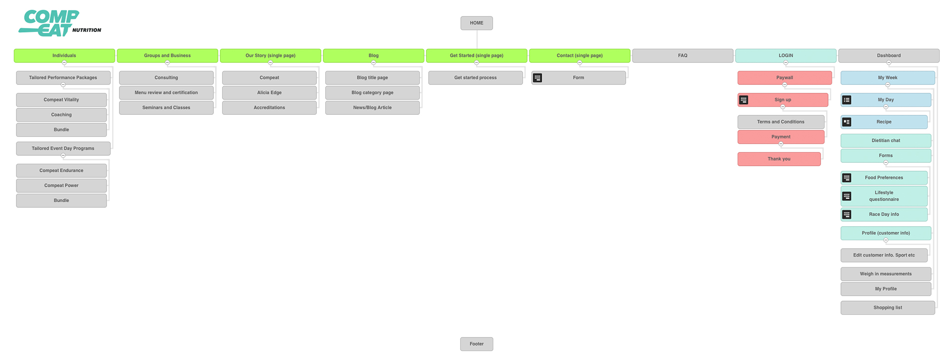
Version 1: Marketing is in green - Membership section with monthly plan
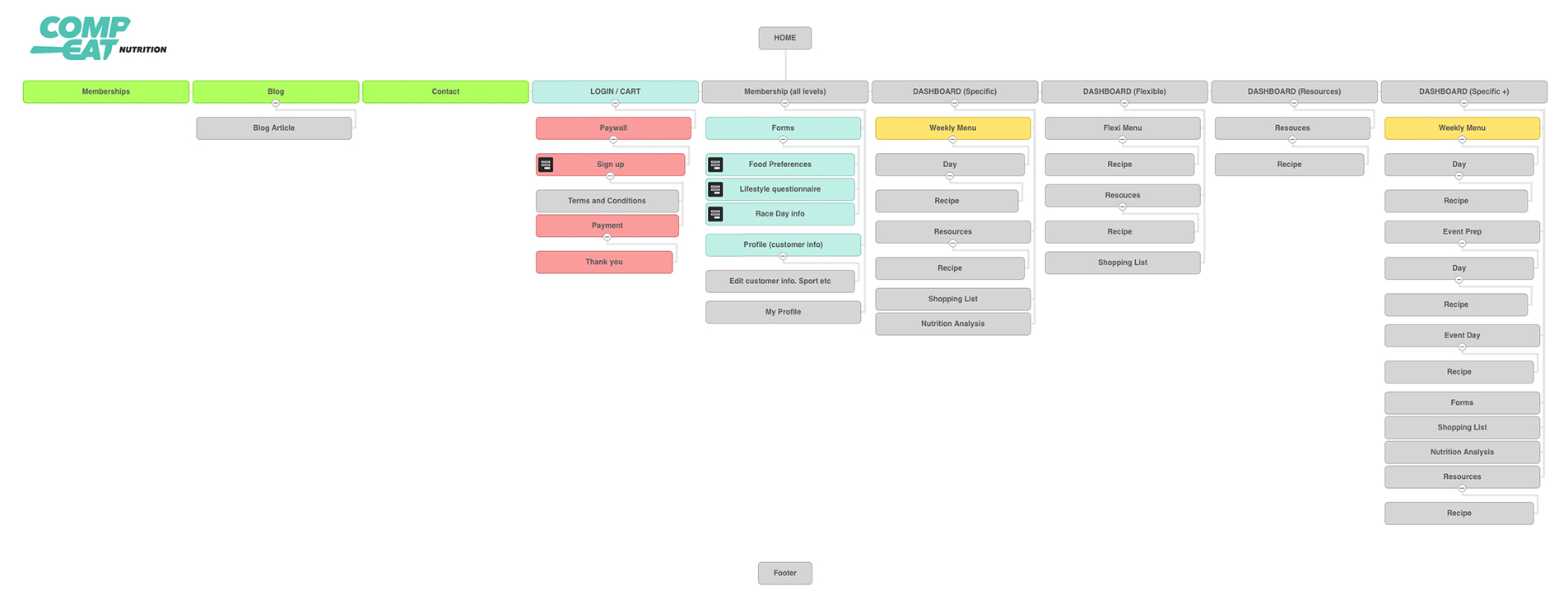
Version 2: Marketing is in green - Multiple membership options, the customer would only see one at a time
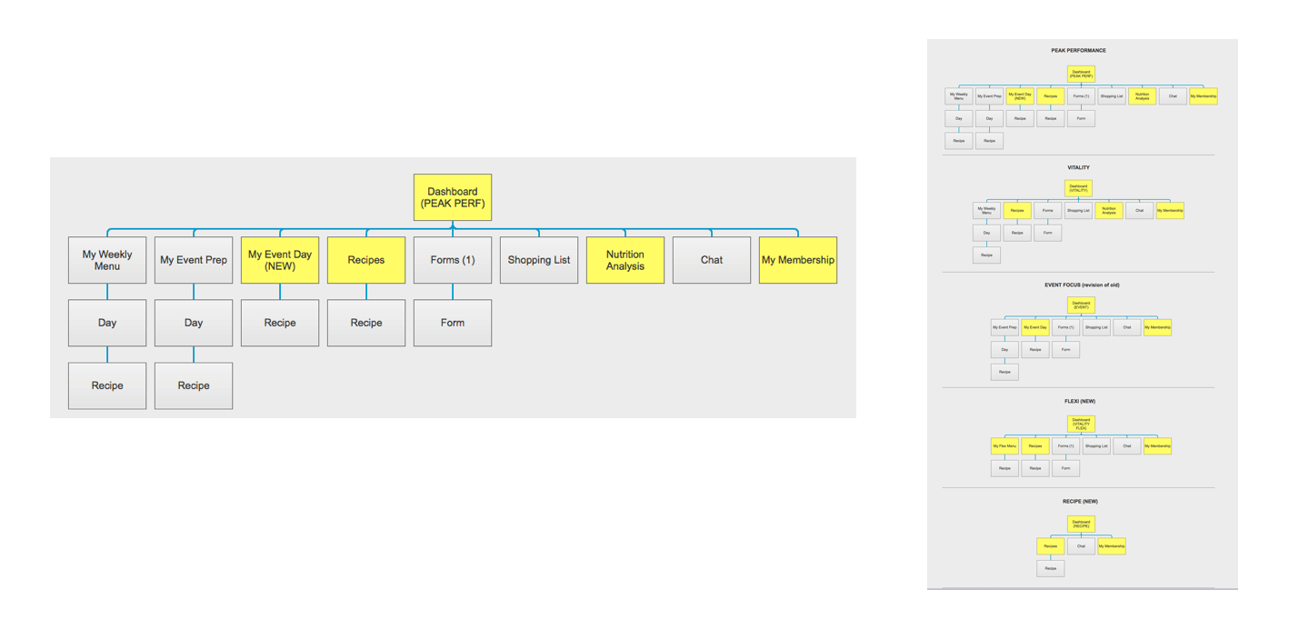
Membership sitemaps - yellow indicating new pages to be developed
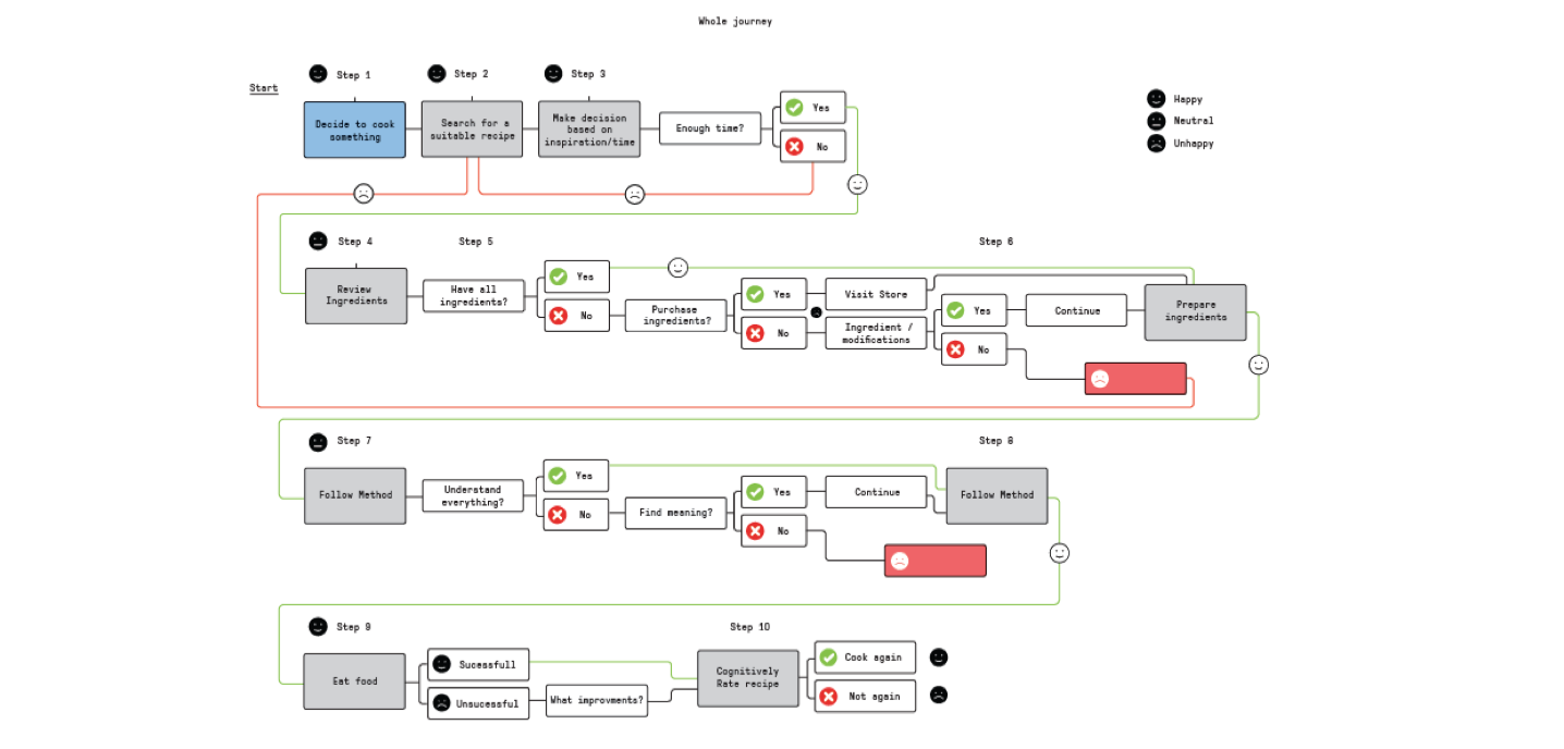
Flows
We made flow diagrams to understand the complexity in the system and check that simplified flows would work. Discussions with engineers were sped up as we could show what design was thinking then get a difficulty rating and amend the design if needed.
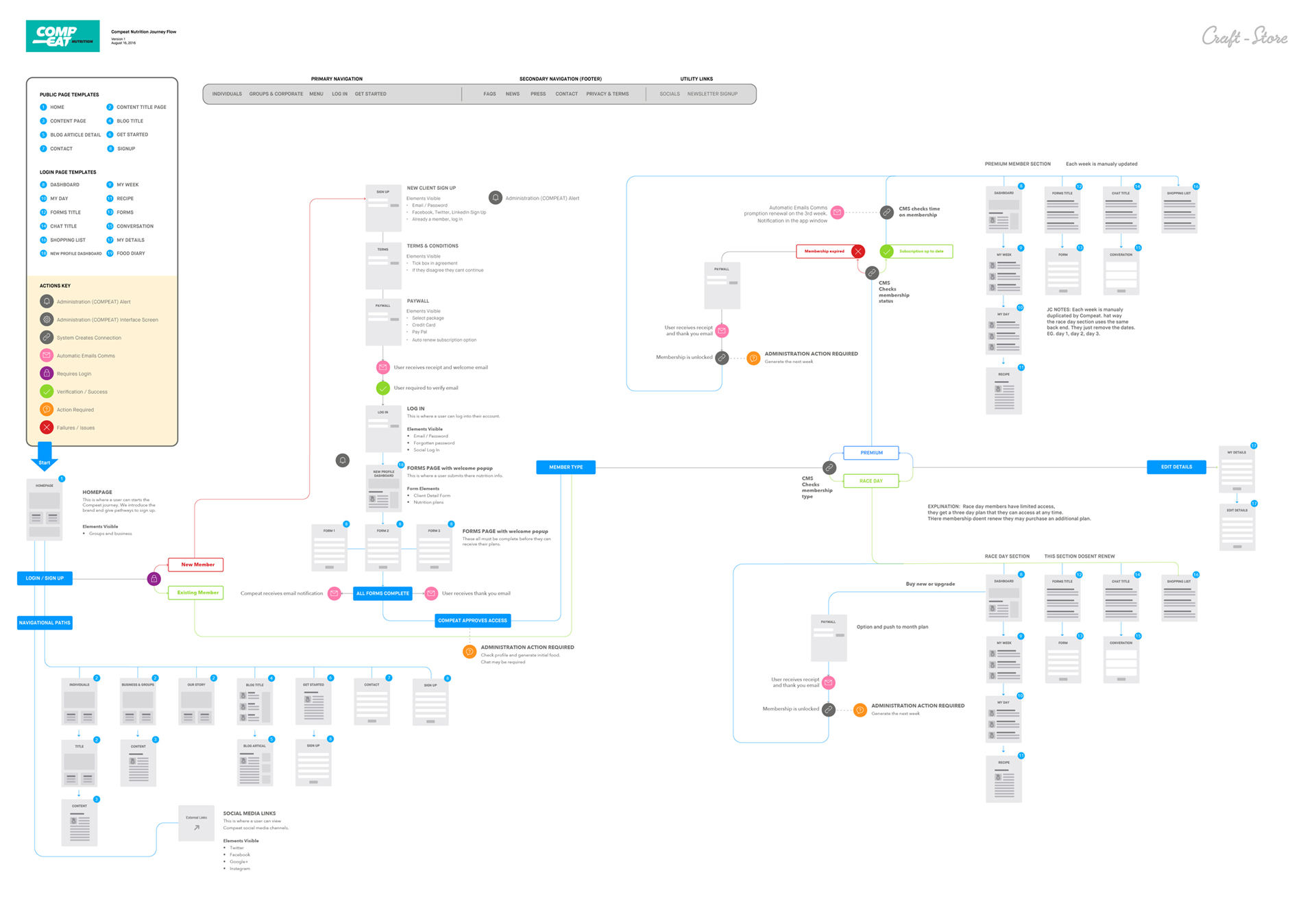
Wireflow for the whole app, including signup flows
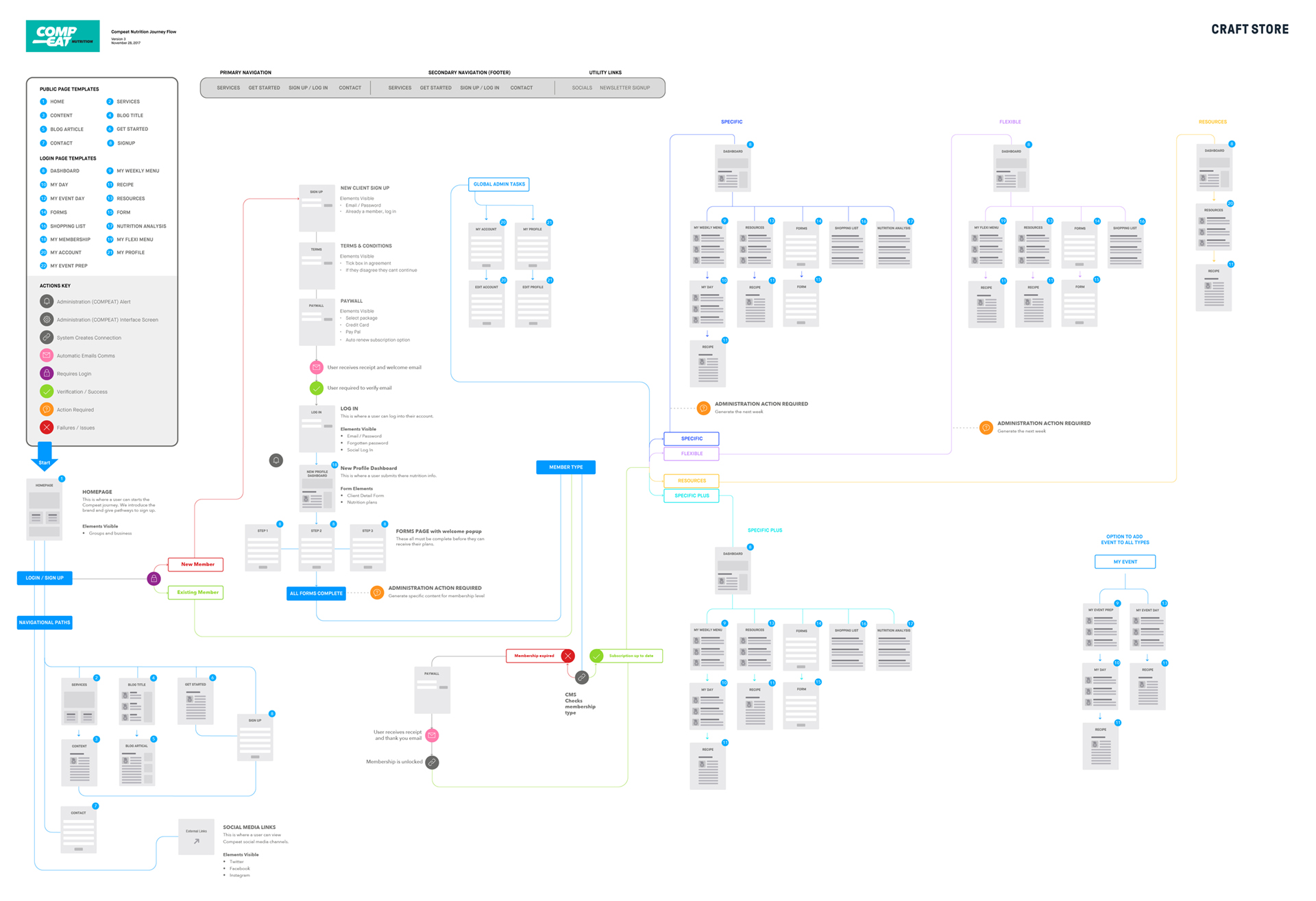
Version 2 flow with simplified front end and more membership options
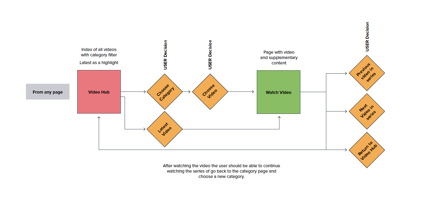
Understanding the recipe flow
Wireframes / clickable flows
We chose to create lo-fi wires first for three reasons. One, they are faster as we don't need to worry about the detail look and feel. Two, the client often got hung up on the detail of the visual design. Three, clickable wireframes are easy in Axure, and we could show the interactions with dropdowns, role overs, and hovers (remember this was in 2016, our great tools today didn't exist).
High fidelity clickable prototypes were made for final approval and testing with Invision. Using screens ready for engineering.